![]() |
| Audi Ad Campaign BBH, London Ian Heartfeld Vinny Olimpio Ian Heartfield Benedict Redgrove Onishi Yasuaki Sebastian Presoux |
Monday, October 31, 2016
Creativity
Wednesday, October 26, 2016
Color Harmony Rules
This week just a quick rundown through a few images that align well to some color harmony rules.
Analogous scheme running from greens, yellows, oranges, to reds.
Monochromatic blue scheme, balanced by dark and light values and repetition of shapes
Triadic scheme, greens in the background, purple and blue flowers, and orange in the sweater and skin tone saturation and brightness has been adapted to keep any one color from creating friction with the rest of the composition.
![]() |
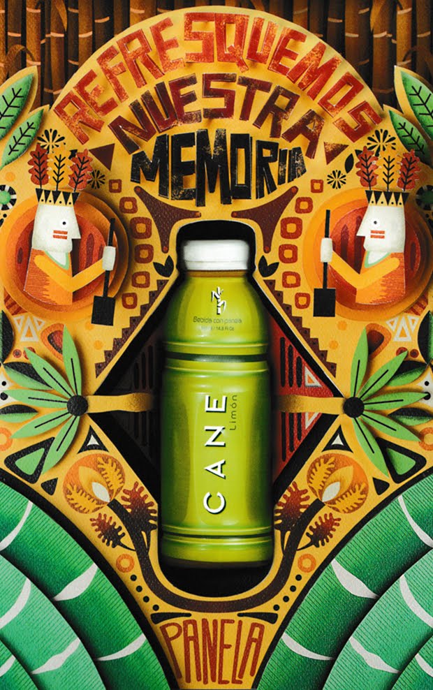
| "Let's refresh our memories!" for Panela Creamos, Medellin, Columbia Jorge Montoya E Sara Sarmiento Diego Rolda Carlos Montoya Bryan Olaya |
![]() |
| "38 million times..." for UOL music Deezer Africa, Sao Paulo Andrea Siqueira Alexandre Kazuo Lucas Ribeiro Lambuja |
![]() |
| AlmapBBDO, Sao Paulo Bruno Prosperi Luciano Lincoln Fabiano De Queiroz Cesar Herszkowicz Pedro Corbett Adelmo Barreira Marcos Sachs |
Complementary scheme, oranges in reflected light and backgrounds. Blues for the focal point and outfit pieces. Saturation is reduced on the oranges to help balance out with the bright blues.
![]() |
| Brian Hodges Robert Bacall Representatives |
Wednesday, October 19, 2016
Color Inspiration
Moma Advertising,
Sao Paulo
Rodolfo Sampaio / Pedro Vargens / Danilo Maia, Lucas Ribeiro / Pedro Vargas
I really enjoy the clear contrast made with the complimentary colors in this series. The even divide of complimentary color schemes works really well to make interest. An even mix of cool and warm creates approachable pieces, while the flip in the focal point helps emphasize the message. It's balanced in shape as well. Meanwhile there is great emphasis made with position and orientation of the shapes in the focal point.
Leo Burnett Tailor Made,
Sao Paulo
Marcelo Reis, Alessandro Bernardo, Vinicius Stanzione / Ricardo Alonso / Renato Ramalho / Kako
This series moves toward earth colors. In particular with the soft-warm pinks make the sky vibrant and fascinating the cool blue snow and waters relax, the tint of the snow in particular creates a more vast sense. There is excellent emphasis created by the placement of the word "jeep," in both pieces. The shade creates depth, and assists the perspective for both as well. The shading and gradation of the composition in the second image is magnificent.
Wednesday, October 12, 2016
Positive and Negative Space
![]() |
| Elementary Structure TAPE OVER Artlake Festival, Berlin tape art mural installation Print - Summer 2016 |
Wednesday, October 5, 2016
Personal Selections
This post is going to be a mix up. After having time to flip through the books Paul has given me over these past few weeks, I've made a few selections that I particularly liked. I'll keep things brief and just point out a bit of what I like about each one. Hope you enjoy them.
Depth by overlapping, great textures and the brush provides a lot of tension
![]() |
| G. Collette and J. Dufour Amsterdam Type Foundry "Independent" (promotional image, 1930) ~ 20th Century Type Lewis Blackwell |
Asymmetrical balance, good use of negative space to give weight.
Roger Excoffon
"Choc" (promotional image, 1953)
~
20th Century Type
Lewis Blackwell
"Choc" (promotional image, 1953)
~
20th Century Type
Lewis Blackwell
Depth by overlapping, great textures and the brush provides a lot of tension
![]() |
| Michael Going SX-70 Manipulation ~ Archive Vol. 4 - 1996 |
High staccato rhythm, very cool depth created by perspective and contrast.
![]() |
| Minoru Kawase, Yoshimitsu Tenbata Volvo "untitled" (promotional image, 1996) ~ Archive Vol. 4 - 1996 |
Very balanced, type and logo near the bottom unify with the paint splatter near the top. Awesome emphasis on the negative space where the car shape is.
Isolated dark figures kind of balance out the repetition and placement of the red chairs and tabletops. Surreal perspective on gruesome event.
![]() |
| Jon Haddock "Cafeteria" ~ Print 2002 |
Isolated dark figures kind of balance out the repetition and placement of the red chairs and tabletops. Surreal perspective on gruesome event.
![]() |
| "The Thinkers" Published in Raw ~ Print 2002 |
Unified by the repetition of all the boxes and the lines that connect them. Tons of movement happening in this and is overwhelming with the great variety of shapes.
Wednesday, September 28, 2016
Depth
![]() |
Adbusters
November/December 2016
|
Wednesday, September 21, 2016
Rhythm
![]() |
| Michael Marsicano "After I Was Thrown in the River and Before I Drowned." Illustration of a short story by Dave Eggers 14 1/4 x 9 1/2, ink, graphite, digital ~ Communication Arts May/June 2016 |
Wednesday, September 14, 2016
Balance
![]() |
| A. Richard Allen "Love Lies Bleeding" Illustration (series) ~ Communication Arts May/June 2016 |
Tuesday, September 6, 2016
Unity
Mike Meadus created a clean and unassuming piece, that manages to be tightly unified. Upon a closer look the contrast draws the eye from the center focal point downward. Every shape is set upon an invisible grid. Shapes are placed symmetrically to one another and on any give horizontal line, the shapes do not vary in size and are repeated. Only a single shape is used to create the primary image, a circle. Upon initial view, the image may appear to be something of a simple shape, or square. Given a split second, the eye moves toward the focal point which is defined by tight grouping, and a single large -- nearly -- semi-circle gap below the "mustache" and "beard." Likewise, to the so-to-speak invisible grid, the outlying shapes are constrained by an invisible rectangle, centering an framing the image by leaving equal negative space above, below, and to the sides. The illusion of a thick beard is given by tightly grouping circles. The composition creates closure by guiding the eye from larger, tightly grouped shapes down to smaller, looser shapes near the bottom. Creating a top-down movement. Continuity is achieved through the use of repeated shapes, and symmetry, but is briefly broken to create a focal point. However, the overall image appears unified, in terms of gestalt principles, as larger image it almost comes off as a simple brown rectangular shape among a green background.
Monday, August 29, 2016
Variety
![]() |
| Andrew Miller "untitled" ~ Adbusters September/October 2016 Cool Fascismo |
The image above stood out to me due to it's claustrophobic composition. In the foreground around the man there is a variety of materials; toys, books, figurines, photos and so on... All elements are compartmentalized by shelves, creating something of a grid-like pattern. Every shelf is filled, some over-filled. The orientation is rotated to create an unnatural cascading movement. As if all the pieces were crumbling around the man near the middle of the image. Despite it's variety, the image is unified by the grid and size of compartments.
Subscribe to:
Posts (Atom)